KPI and gauge
Use KPI for one headline number. Use a gauge only when the number has a meaningful target or range.
Datplan help
Choose the row grain before the visual. Then select the category, measure, aggregation and filters that match that grain.
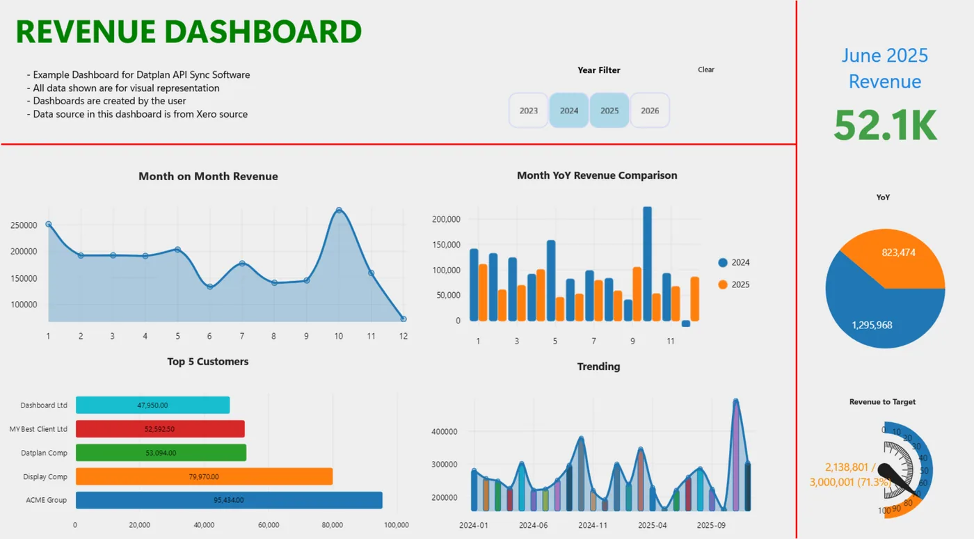
Chart guide
Use KPI for one headline number. Use a gauge only when the number has a meaningful target or range.
Use bar, grouped, stacked or horizontal bar for categories, rankings and composition.
Use line for a time trend and area when the magnitude beneath the trend is useful.
Use only for a small number of parts of one total; switch to a bar when labels or differences are hard to compare.
Use to compare two numeric measures and optionally represent a third measure with bubble size.
Use heatmaps for intensity across two dimensions and maps only when location data is complete enough to support the question.
Use specialised visuals sparingly and verify that shared scales and categories do not imply a false comparison.
Use a table for exact rows, audit review, detailed research or a cross-check before relying on a summary chart.
Dashboard questions
Use a KPI for one number, bar for category comparisons, line for time trends, scatter for relationships, heatmap for a two-axis intensity pattern, map for geographic data and table when exact rows matter.
It is a visible control that can narrow multiple dashboard items. A chart-level filter is configured inside one chart and affects only that item.
Yes. Lock the dashboard to prevent accidental moves or resizing, then unlock it when you need to edit.
You can export a dashboard to PDF and copy chart content. Per-chart CSV export is available where supported. Use the API Pull or BI export workflow for complete source datasets rather than assuming one dashboard-wide CSV.
The Windows app is free to download and includes Datplan Demo data, so you can test sync, dashboards, reporting grains and exports first.